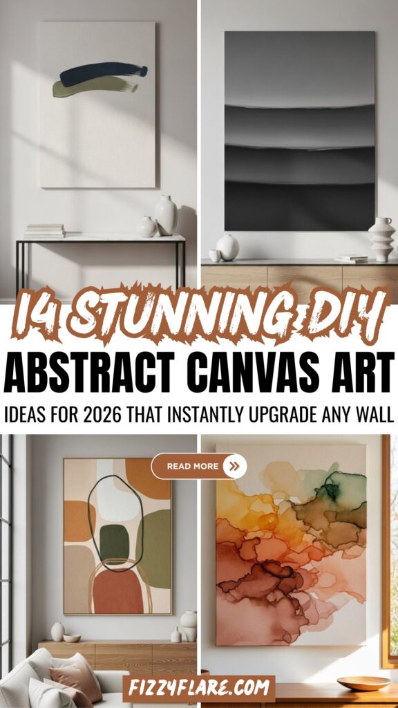
14 DIY Abstract Canvas Art Ideas For 2026
This post may contain affiliate links: full affiliate disclosure.
I’ve seen it happen a lot: someone starts a DIY abstract painting with a lot of excitement, but then they stop because the colors don’t feel right and the canvas looks messy.
People say that abstract art is supposed to be liberated, but for novices, it can be hard to understand and not forgiving.
The problem isn’t lack of imagination; it’s that most guidelines don’t talk about how to structure things.
When you know how to use balance, space, and color, abstract canvas art looks great. In this article, you’ll discover 14 DIY Abstract Canvas Art ideas to try confidently in 2026.
Why Abstract Canvas Art Works in Any Room?
Abstract canvas art works because it doesn’t tell the eye what to see. Instead, it lets the eye breathe.
Abstract art doesn’t have real subjects or settings; instead, it changes to fit in with its surroundings instead of fighting with them.
They reflect the colors, shapes, and moods that are already in a space, making them feel like they belong there instead than being in the way.
Abstract art may be used in any area, whether it’s simple, modern, or layered. It adds interest without being too much for the decor.
Save this article for later! 👇👇
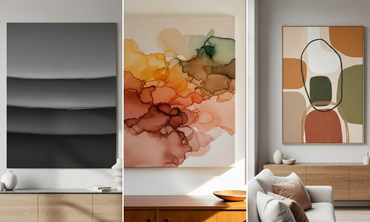
Fluid Triptych
Movement becomes the visual anchor, making this DIY perfect for long walls where a single canvas would feel static.
Split one continuous abstract flow among three canvases, making sure the colors go in the same direction so that the artwork seems like one piece.
Use broad strokes to layer acrylics, and then add subtle metallic accents to give the painting more dimension.

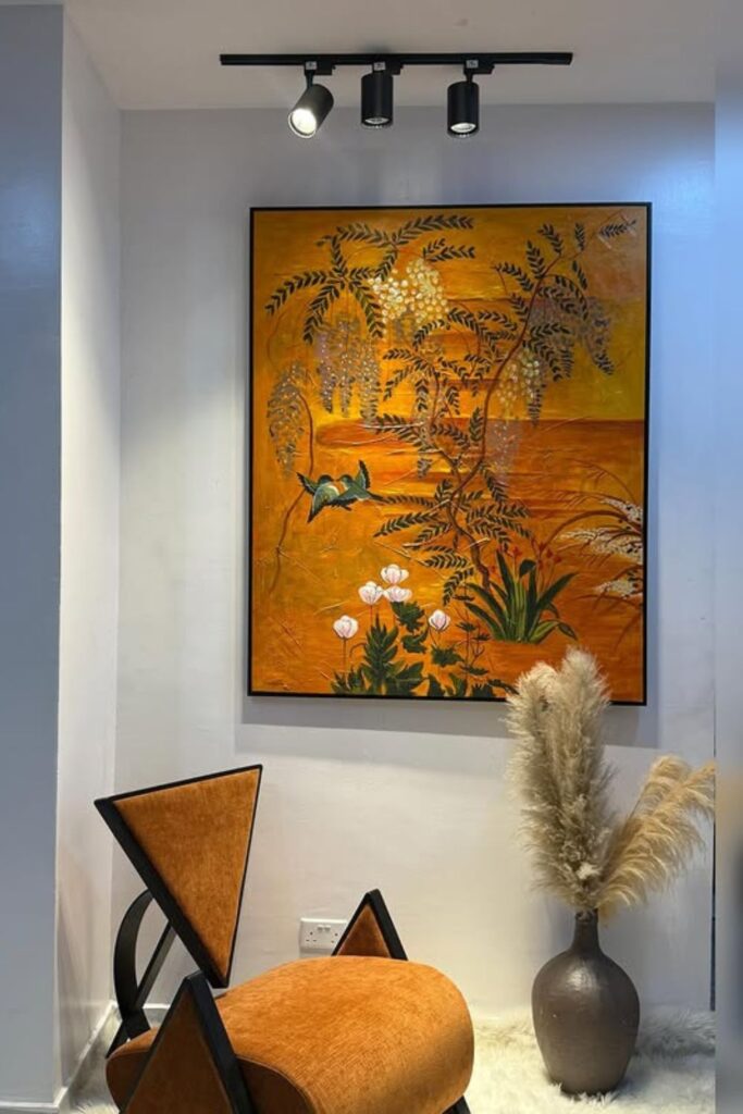
Botanical Texture
Organic motifs bring warmth without turning abstract art into literal décor.
This DIY looks excellent in hallways or reading nooks when one thing can tie the whole room together.
Use earthy acrylic colors to make a warm base, then use a palette knife or modeling paste to add roughness that sticks out.
The art is expressive because of the subtle plant shapes on top, and the metallic accents provide depth and serene luxury without taking over the space.
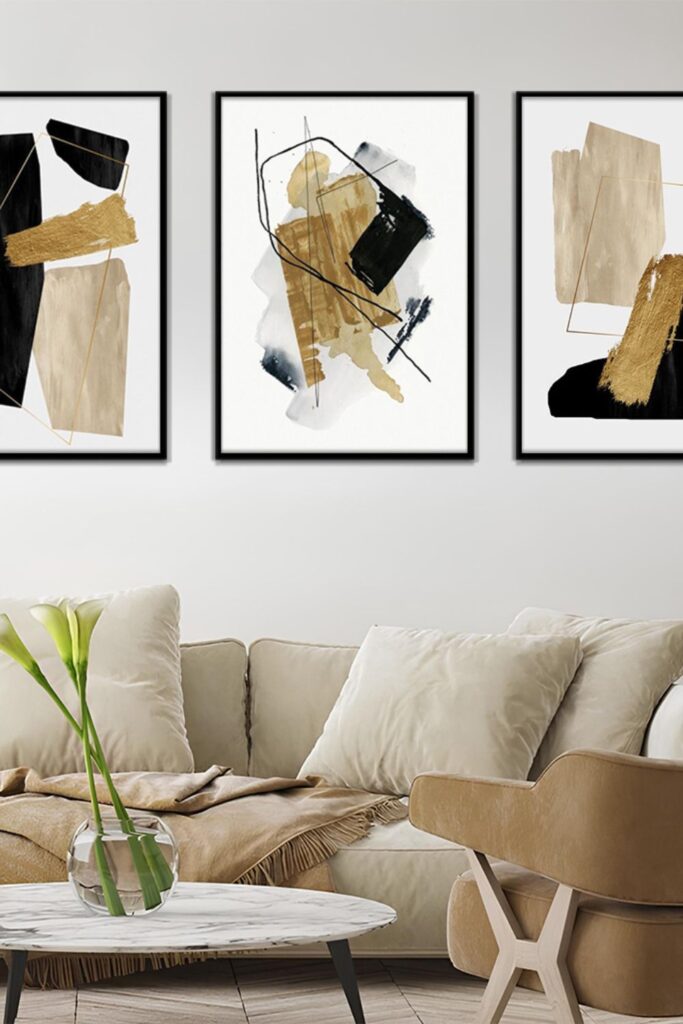
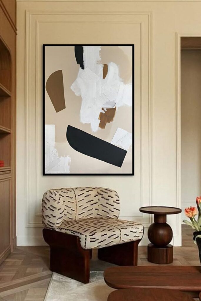
Color Blocking
When abstraction is too much to handle, bold shapes might help you feel more confident.
This DIY looks great in modern living spaces or creative studios where dramatic contrast gives the room life.
Use painter’s tape to construct huge shapes, then fill them in with flat acrylic color instead of blended strokes.
The black foundation keeps the brighter colors in check, while the irregular edges make the piece look less stiff.

Textured Layers
When texture takes the place of brushwork, depth becomes the most important thing.
This DIY is great for elegant areas like dining rooms or where subtle subtlety is important than bright color.
Make the base with soft, mixed acrylics, and then use a comb or sculpting tool to push round shapes into the wet surface.
A few metallic highlights on higher sections capture the light organically, giving the art a peaceful, gallery-like presence without any disturbance.

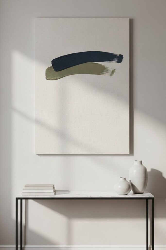
Linear Contrast
Sharp lines bring order to abstraction, making this DIY ideal for calm living rooms or minimalist seating areas.
Start by making the canvas with gentle, neutral blocks. Then add bold black shapes to hold the composition together.
Using a paint pen or small brush to make fine lines provides the area structure without making it feel crowded.
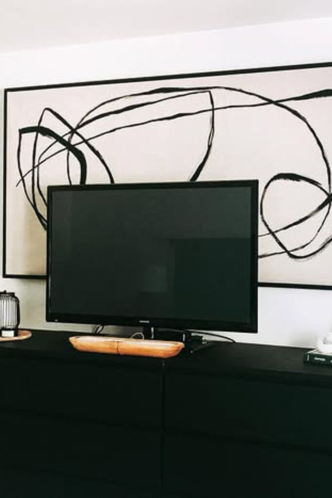
Gesture Lines
Confidence comes from restraint, not detail. This DIY suits media units or console walls where visual calm matters.
Use a single dark line color over a warm neutral base to make an effect, and let your hands meander over the composition.
Make the canvas broader than the furniture underneath it so that the art stays grounded and purposeful instead of just for decoration.
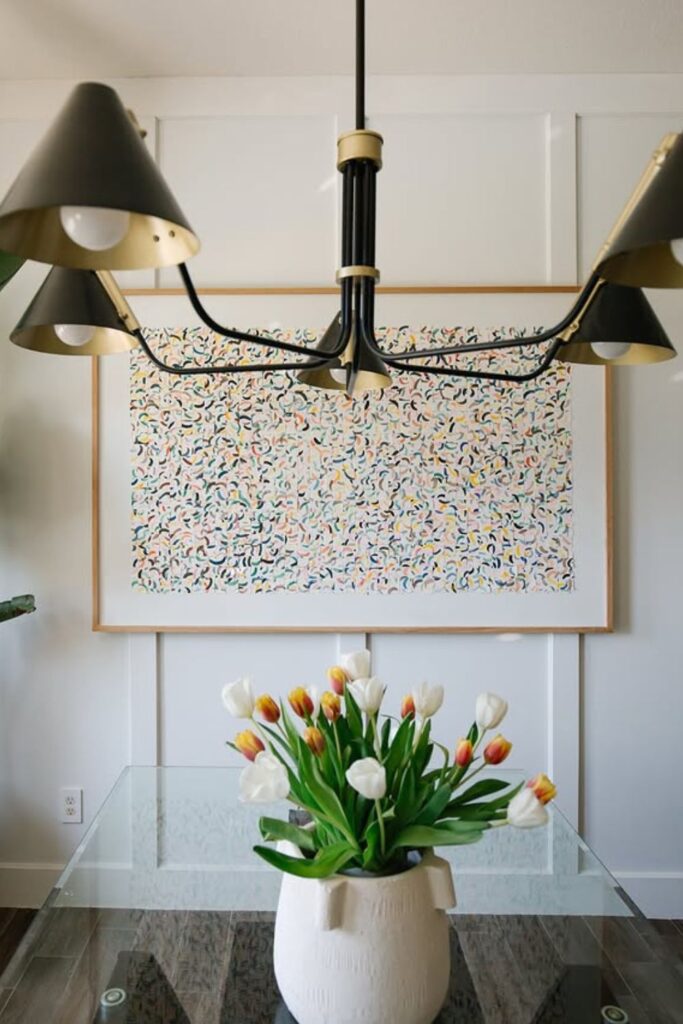
Micro Motifs
This DIY is great for dining rooms or creative spaces because appeal comes from repetition instead of size.
With a fine brush or paint pen, draw small, curving lines on a neutral background. Make sure the spaces are big enough but not too big.
The small number of colors keeps things from looking too busy, and the pattern that goes all the way around the room adds movement that makes it feel alive without taking over.
Sculpted Neutrals
When texture does and the heavy lifting instead of color, contrast feels deliberate. This DIY is perfect for quiet locations to sit and bedrooms where comfort is crucial.
Use thick white paint or modeling paste in loose, layered strokes, and make sure the tool marks show.
on anchor the composition, add some dark, curved shapes on the canvas. The lack of adornment makes the art feel more like a building than a decoration.
Negative Space
Restraint turns simplicity into impact. Allowing empty areas to remain visible gives the eye space to rest and makes every painted mark feel deliberate.
Concentrate on one shape or stroke that expresses something, then take a step back before adding more.
The openness of the area around it does the rest of the work, making this style perfect for bedrooms, offices, or any other place where visual calm is important.
Monochrome Depth
Working within a single color family creates quiet sophistication. Instead of relying on contrast, build interest through layers of light, mid, and deep tones of the same hue.
Soft blending and dry brush strokes make the surface feel three-dimensional without making it look too busy.
This method works well in the small rooms or tranquil spaces where small changes feel more planned than big color changes.

Organic Balance
Flow feels natural when edges stay soft and forms remain imperfect. Let rounded shapes grow, overlap, or float away without making things look even.
It makes the canvas attractive and easy to see at the same time to change its size.
This style is perfect for casual living areas and where warmth or flow are more important than straight lines or perfect alignment.
Minimal Geometry
Control becomes striking when it contrasts with imperfection. Place one or two clean geometric forms over a loosely painted base to create quiet tension.
When there is texture and slight movement around sharp edges, they feel like they were meant to be there.
This balance works best in modern, architectural areas where people want structure but the art is easy to look at since it is soft.
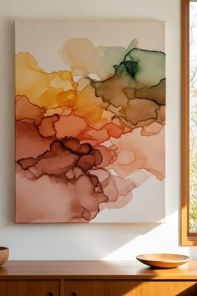
Earth Wash
Subtle color shifts can feel more expressive than bold strokes. Thinned acrylics allowed to flow freely across the canvas.
Create soft layers that feel rooted and natural. Allow pigments to settle and mix without any control, even if they dry unevenly.
This method goes well with wood textures, neutral fabrics, and rooms that are warm, natural, and simple.
Asymmetrical Focus
Balance becomes more engaging when it avoids the obvious. Shifting the main visual element away from the center creates movement.
Soft textures in other places keep the canvas from floating away. The eye moves about organically instead than staying in one place.
This style works well in hallways, on small walls, or in rooms where predicted symmetry feels boring and flat.
FAQs
Can abstract canvas art still work if my room already has a lot of texture or pattern?
Yes, but it’s vital to hold back. If a room already has strong textures or patterns, abstract art should make things easier instead than fighting with them.
If you use fewer colors, softer transitions, or more negative space, the canvas might add to the room instead than taking it over.
Do abstract canvas pieces need to match a room exactly to look intentional?
Exact matching isn’t always necessary and might make art seem forced. When abstract art echoes one or two existing tones and adds subtle contrast, it seems more natural.
This makes the object look connected without making it look like it’s part of the furniture or walls.
You may like to read!
- 20 DIY Cat Toy Ideas
- 26 DIY Christmas Ornaments Ideas
- 19 DIY Lamp Shade Ideas
- 21 DIY Anniversary Gift For Him
Fasial is the founder of the Fizzy Flare. He has been a passionate blogger since 2021. He ran three different websites in the past few years. Now he is focusing on Fizzy Flare to build an audience and help them organize their life.